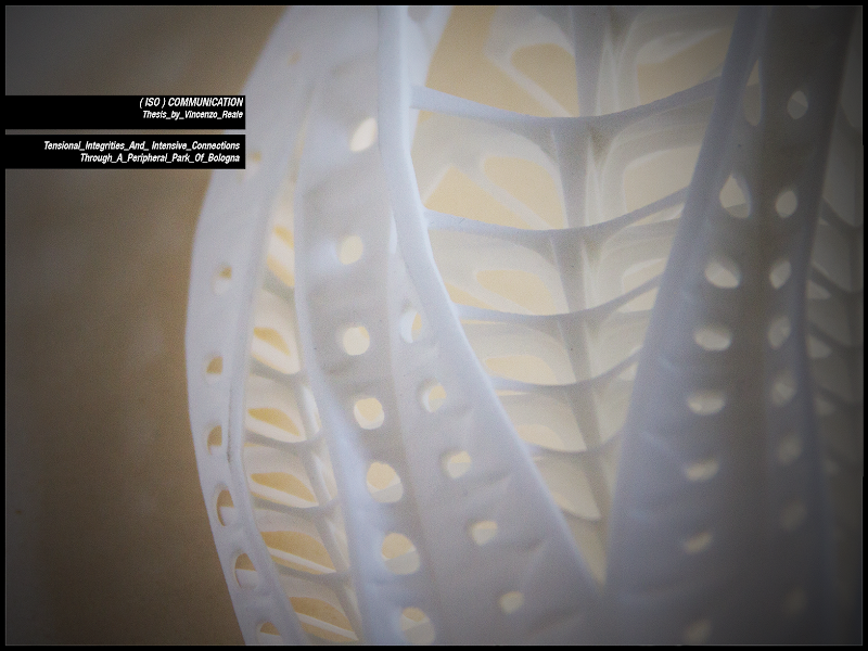
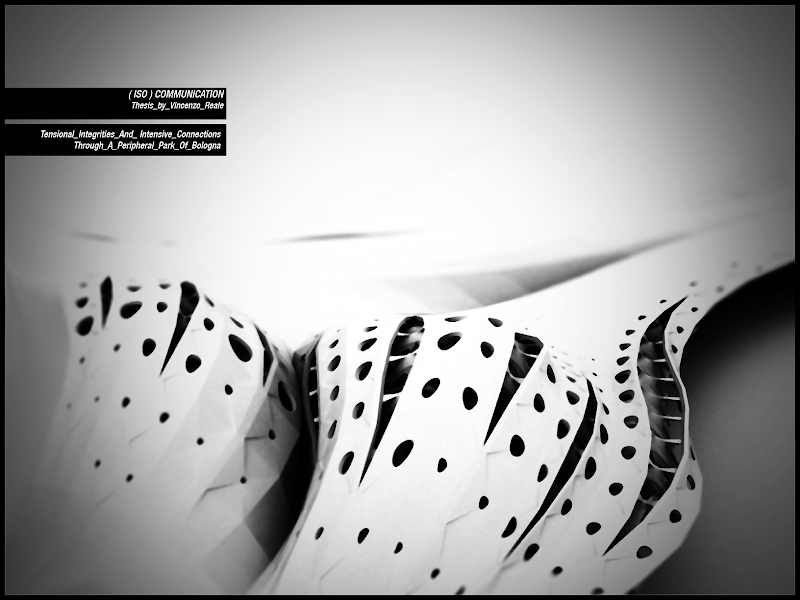
“(Iso)Communication, tensional integrities and intensive connections through a peripheral park of Bologna" is the title of my composition project at Bologna University, in which themes such as tensegrity, form-finding, material and structural properties of complex systems, parameterization of physical behaviours, interaction of surfaces and components with external force fields, rapid prototyping techniques were discussed, in the search of elegance through a perpetual dialectics of complexity and refinement.
I have to say that all this work was made possible thanks to the help of outstanding and high profile people I had the fortune to meet. My thesis supervisors prof.Alessio Erioli, who introduced me to the contemporary techniques of designing and gave me an incredible amount of hints and suggestion, and Ludovico Lombardi who also helped me with his precious advice. All the undergraduates I share opinions and thoughts with (you can see many of them in the right link columns) and my classmates Alessandro Zomparelli and Mario Da Deppo for their incredible assistance. I think that a lot of very very interesting works (I don’t know if mine is so interesting) came from that ambient and these people and I believe is a very honourable matter in an Italian university which is almost completely forgotten by politics and lacks of almost everything these days. Hope these things will change someday..
Anyway, the entire thesis process took me about a year so, even tensegrity is becoming a common topic nowadays, when I started to think about it was not so common in architectural thesis.
I would not publish the entire thesis text here for space reason, but I am providing a file on Issuu with the printed part in Italian (less but different images in it). I will translate it completely when I will have some time or requests. I have to say that I would like to have a real publication but I have no clues about it, so if you have any suggestion I will appreciate and be thankful.
[You can find more pictures about my thesis both on Flickr and Picasa.]
[Scripts may be not optimized but I tested them all before publish the post, and they do work. So you can try them and let me know what you think about]
This is the thesis abstract:
“ISO: a combining form meaning “equal,” used in the formation of compound words: isochromatic; [..]
Communication: a process by which information is exchanged through a common system of symbols, signs, or behaviour [..] the various methods of sending information between people and places.
You may recognize how the lack or failure of "communication", intended as an exchange of information and data in complex systems, is a potential cause of the paralysis, stagnation or necrosis of the systems themselves.
The definition of hyper connected systems, where, each time a channel is prevented, others become automatically activated and competitive, or where different channels operate simultaneously, even in non-critical situations, enables them to provide not only optimal performances (albeit potentially less effective than a single “ad hoc” solution) but also adaptable and dynamic responses to other external stimuli, and leads to more globally efficient solutions.
The Park (“Parco dei pini”) in Pontelungo (a suburb of Bologna) shows a chronic lack of communication between the parts that make up the system. Several critical issues come from this lack (degradation, abandonment, social dangerousness, etc. ...). The goal then becomes to define a sustainable and highly connected system that weaves the different parts of the site and develops their potential, ending critical situations and creating a series of dynamic interactions that lead to positive mutations.
The hyper-connection is translated in breaking down visible / invisible barriers which create discontinuities in the area, in developing landmarks, shelters and crossing paths where these are lacking, but also in the definition of a hyper-connected constructive system, where the efforts to which the structure is locally subjected are distributed globally across the whole architectonical organism making it flexible and resistant to the changing of external conditions.”
The definition of the project starts from the needs expressed by Iceberg Notice, involving the Pontelungo’s area on the outskirts of Bologna. The notice points out how the PSC (Structural City Plan) has selected a number of central places particularly relevant to ensure and enhance the liveability of Bologna at the scale of neighborhood.
Pontelungo and its park were recognized as an area with potentialities to be developed in order to achieve a better level of life for its inhabitants and for the whole city as well.
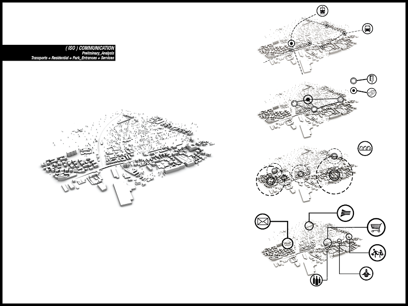
The area is about six kilometres from the inner city of Bologna and it is connected to it trough a main thoroughfare (via Emilia) and well served with public transport (buses). In front of its park there is a little station of a local train line.
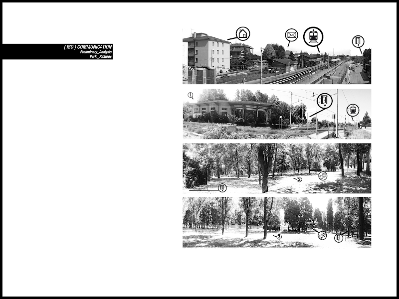
The park is not viewed by the neighborhood as a place for aggregation but it is lived as a scar in the city fabric because it has been abandoned and it is considered dangerous, always almost completely desert, as photo analysis can depict.
It is divided in two parts. The upper part is not accessible for the inhabitants because of artesian aquifers managed by a private company. It has been planned to be re-open in about ten years.
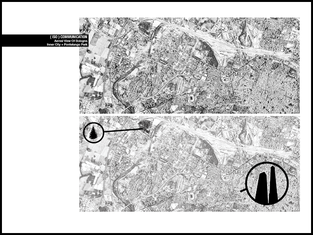
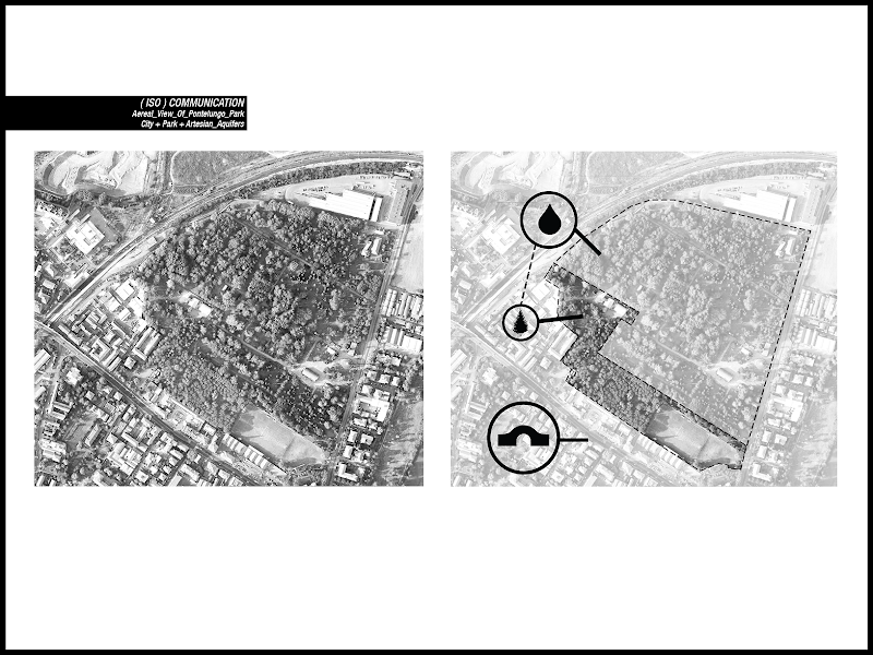
The lower part is the only walkable, and inside there is a very small theatre.
The whole park lacks of organization, there are no landmarks and no possibilities to have an orientation inside it, to recognize the paths, the entrances. This causes an overwhelming feeling of abandonment.
All around there are many residential buildings, a school, a supermarket, a distillery, a post office and a police station, that is services and a living social fabric rich of potentialities.
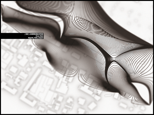
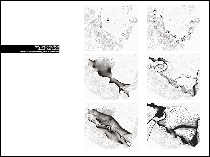
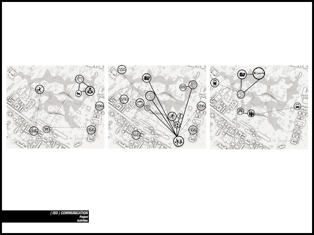
I tried to simulate the flows of people and the power of attraction of the different activities with a magnetic/electric paradigm, considering two situation. The first, external, where the activities were negative attractors and the entrances to the park were the positive ones, and a second, internal, where the entrances were negative and the theatre was the positive attractor. And then, overlapping the results, you can see how the magnetic fields created by these configurations depict two different non-interacting situation, due to the peripheral position of the park’s entrances and the lack of internal activities.
This very useful script is not mine but comes from the mcneel site, you can find it here.
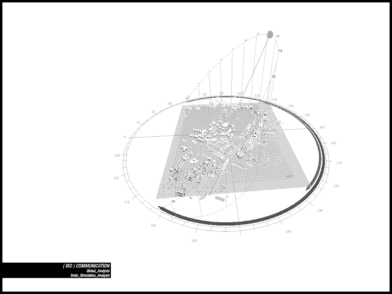
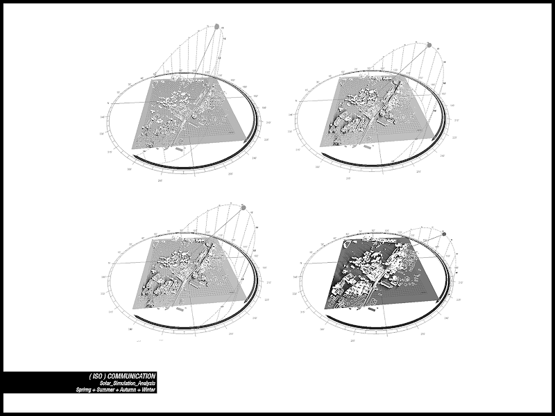
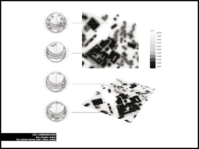
Later on I made a 3d model of the entire area (ground, buildings and tree, detailed cad maps of them where provided by the municipality) and started some solar analysis. I considered different solar condition: the two equinoxes and the solstices. As you can see, even if there are a lot of trees they are not well distributed, creating very closed areas and scattered clearings, irradiated by the sun.
As output I collected shading values in specific points and solar radiation as a surface of values, which covers the whole area. A good software to do this kind of analysis is Ecotect ® (you can find a product trial here) which, as I will say later, has also the possibility to work in cooperation with rhino, either with rhinoscript or other plugins.
To reduce the loss of time spent in repetitive operations you can write very simple scripts to let the program do the work. This is a script that copies and places a selected object, as a block with a selected base point, in new positions defined by a point cloud: blocks positioning. rvb
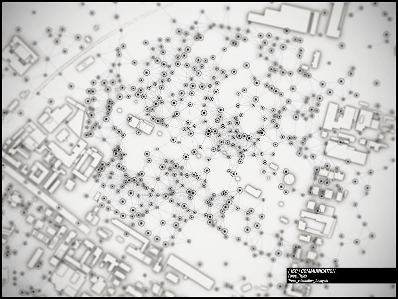
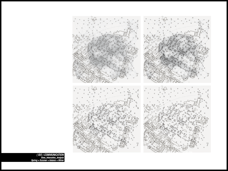
Finally I managed to define a trees representation that would have given an image and be a map of the site arboreal conditions through different periods of the year.
I had a map of trees, but it was only a bunch of points. So, and here scripting came in help again, I decided to draw line within trees respecting proximity rules (enough close - draw a line, too distant - do noting). Modifying the threshold I defined a map visualization of the growing vegetation, and the clearings as well, during different times in a year (seasons). This is the scripting files: proximity lines.rvb
Automating simple tasks can give you very nice feedbacks not only in 3d modelling. And they can be even better if you run the script and then make some post production exporting the data to a 2d graphic vector software (Adobe Illustrator is the most famous one, but you can also find open source and free software such as Inkscape ).
Then I had to use these collected data. Firstly I designed simple line to connect the entrances (current and future ones) and some points of interest inside the park (nice views, children spaces, clearings, theatre entrance, park entrance, train station, etc..).
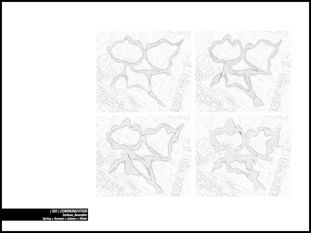
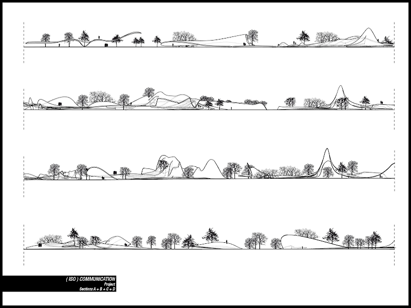
Then I wrote a script to design a pavilion’s profile, with a minimum and a maximum section assigned (width but also height) and link it to the points of interest proximity AND the irradiation values (taken from the testing surface).
Also the main profile line was forced to modify its path in search of the most irradiated areas. This way I could have a path growing while crossing the clearings and the most crowded places, and reducing itself while approaching the thicker trees areas.
With a strong changing of thresholds values I reached different results, similar to the line interaction between trees.
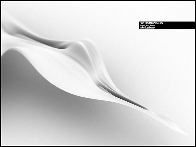
At that point I added another rule: if the pavilion section encounters single trees on its way it should lower and move to let the tree outside the pavilion, and if it was close to an interesting view its border should rise to point out to it or, when both the border were sufficiently close, to create a passage. Different rules of interaction (written as equation with distance as unknown value) gave different results.
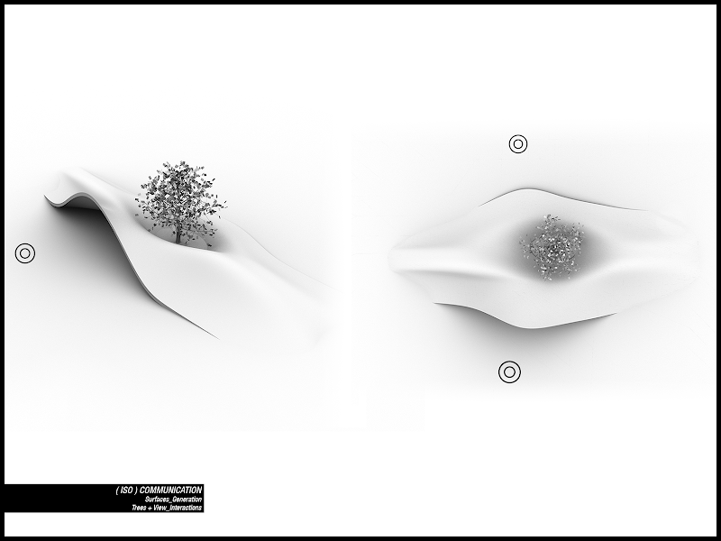
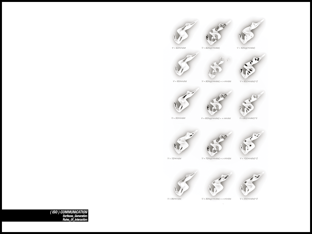
This script raise a line in its part nearest with one or more points: raise borders.rvb
And this one makes sections through planar borders and modifies them with their proximity to attractors (trees) and repellers (points of interest): designing pavilion.rvb
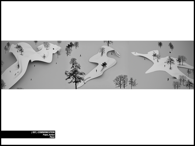
Here some samples.
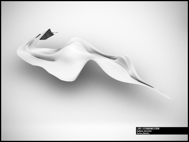
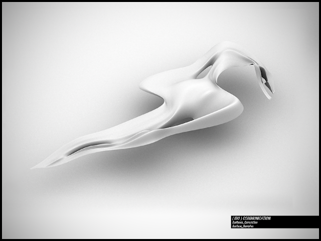
Then I interpolated results trying to design a coherent spatial system in which determined activities take place within new paths and connections. I also tried to link the spatial organization with the possible park’s users: the neighbourhood inhabitants, people from other parts of the city who come to the theatre and, once inside the system, magnetized by other activities and, finally, school children which live the park as a collection of entertainments and opportunities.
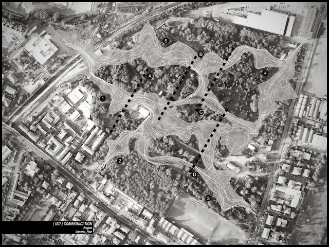
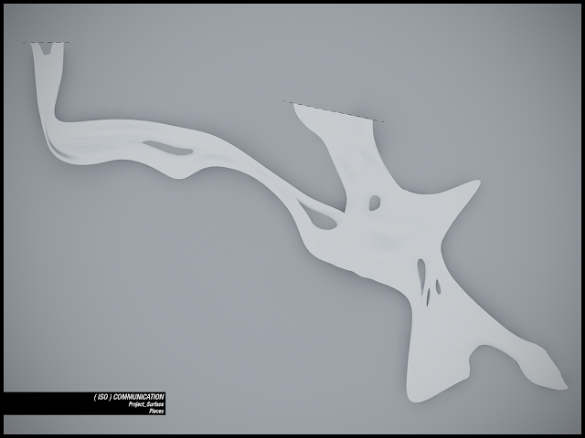
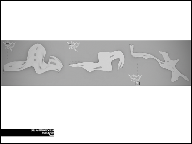
Here some pieces of pavilion.
The hyper connections of paths suggests me the idea of an interlaced structural system, and this led me to deepen my knowledge about “tensegrity”
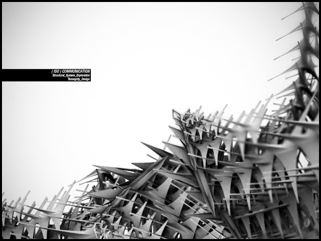
Trying to be short (for more links see the bibliography)
There are many definitions adopted for the term "tensional integrity" or "tensegrity".
One of the first statement defined tensegrity as a structural principle relying on the use of isolated compressed elements connected by a continuous network of stretched components. We can say that it is actually a physical mechanism rather than a type of structure. The term, with this meaning, was coined by Richard Buckminster Fuller in 1955, even though in the same years David Georges Emmerich and Kenneth D. Snelson formulated the same concept. While the first two tried to systematize the subject and define the strict mathematical properties of such systems, the latter was entrusted to a more empirical approach, with which he created a series of "floating " sculptures (an incredible example here.
The term derives from the union of the two words "tension" and "integrity" and means that the integrity of this class of structures depends on the balance between tensions diffuse on them.
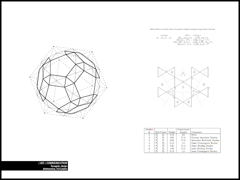
All structures in the universe are subjected to the interaction of forces of tension and compression. Cutting, bending, twisting are nothing but the combination of these basic forces. We usually consider buildings as structures that rely primarily on compression for their stability: the brick wall is the classic example. It stands thanks to compression ("continuous compression), given by gravity, which moves from one brick to another from the top to the ground. The lower the brick is the more compressed it is, supporting the weight of the bricks over it (there is not an optimal distribution of load on different components). No one asks how much a brick wall, or a building, weights. The weight is rarely a consideration in structures which work with continuous compression (even if we take weight into account in special cases, for example to determine stresses under dynamic conditions, such as under an earthquake).
A tensegrity system works in a completely different way.
I found a very interesting this example which is really clarifying: to understand the behaviour of this kind of systems we have to look at two very different buildings : the Washington Memorial and the Skylon.
The first, the obelisk erected in the U.S. capital to commemorate George Washington, consists of a series of marble blocks stacked one on another. It stands because of its weight, working in continuous compression, just as the brick wall .
The second was a sculpture erected during the Festival of Britain near London's South Bank in 1951. Before the festival there had been a competition for the construction of a vertical structure, and architects Philip Powell and Hidalgo Moya had drawn the “Skylon”, which was selected as the best proposal and eventually constructed. It was sixty meters high, a tapered shape of aluminium, suspended by three wires nearly invisible and it seemed to float at seven meters above the ground.
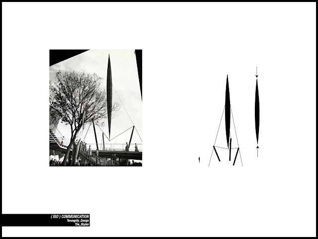
The feeling of ephemeral stability that it conveyed came from its particular configuration of stable equilibrium, in which the aluminium fuse 'weighted', tightening the cables which sustained it from the bottom and, simultaneously, continuously, compressed it from the top. In this way the element is fully compressed and isolated while the cables are completely stretched and continuous.
This kind of systems has many advantages, among others, adaptability to stresses and sudden return to previous equilibrium configurations once stresses decrease, independence from gravity for their stability (they are stable even in absence of gravity), redistribution of local efforts at a global level, etc. ..
While in everyday buildings the constructive system of the Washington Memorial is prevalent, if we analyze how bodies of living beings are actually "built”, in a realm where evolution fixed very strict limits to the weight (that involves an agility decrease and eventually a limitation of survival possibilities), we can see that “continuous compression” is not the winning choice.
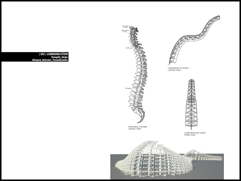
We can find plenty of biological tensegrity‘s examples in biological world: in the mast of a plant (Frei Otto did some very interesting experiments about it, you can see some of its models remade by students here, work and pictures by Jonh Efel, I thank him to let me use them) with compressed segments and tense tracheids; in the neck of an Apatosaurus (Brontosaurus) , with a length of about ten meters, made of compressed vertebrae and tense muscles; in the neck of a mammal like a horse or the in human vertebral column, as I will explain.
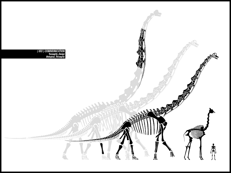
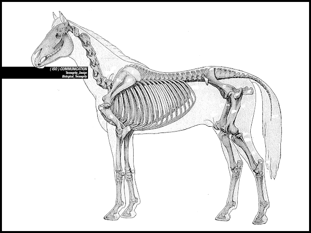
Our vertebral column, when we are standing, runs into the direction of gravity, while in the other quadruped mammals the two directions are perpendicular, showing a different set of issues to be solved differently, but almost by the exact same set of muscles and bones of our relatives.
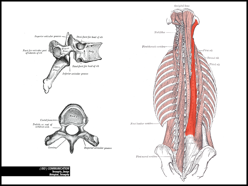
Looking at the front of a human vertebral column we realize it is a bad candidate to carry the weight of the whole body: it is composed of spongy bone interspersed with elastic compressible discs. The posterior section of the spine, the neural arch, consists of more solid bone bristling with spinous, transverse, and articular processes ("process" in anatomy means a protrusion or bony outgrowth, such as the human vertebrae’s ones). Is it perhaps more reliable?
Different models have been defined to approximate the behaviour of our vertebral column, although it can be said that establishing a complete mechanism is a really complex task.
Anyway, even with approximations, we can consider vertebrae as compressed segments with the processes (protuberances), called neural arches, throughout. The strings or cables (muscles and tendons) are attached to these segments so that vertebrae do not touch each others.
Some parts of an upper segment’s process fall under the superior processes of the closest lower segment, otherwise the structure would be outside the laws of physics, rather than simply seeming to be (and working in a similar Skylon manner).
The edges of the processes are attached from segment to segment: increasing the tension makes the structure becomes shorter and the compressed segments closer to each others, while releasing it makes the segments distance (there is not a continuity of compression).
The spinous and transverse processes of the vertebrae provide a number of holds for the attachment of muscles that surround the column. These muscles form three different patterns:
a) muscles intertransversarii: moving from one transverse process to another, one segment at a time, from top to bottom of the vertebral column.
b) the muscles interspinous: running from a spinous process to another, one segment at a time.
Both these two sets run parallel to the spine.
c) the rotatores muscles: running from the spinous process of a vertebra to the two transverse processes of the lower one. The short rotatores cover only a segment, while the long ones cover two segments, from the spinous process of a vertebra to the transverses of a one two segments below.
The outer layers of muscles (such as the multifidus muscle, the semipinalis and erector spinae muscles) repeat this pattern in a similar manner, covering more and more segments, till the longest ones that run along all the column.
The vertebrae are in this way interconnected and thanks to rotatores muscles create that mechanism that we have previously examined: like the Skylon each vertebra weights on ligaments anchored to the previous one but is simultaneously compressed by ligaments anchored to the next one. So we have a series of floating, compressed elements held together by a continuous web of tense members.
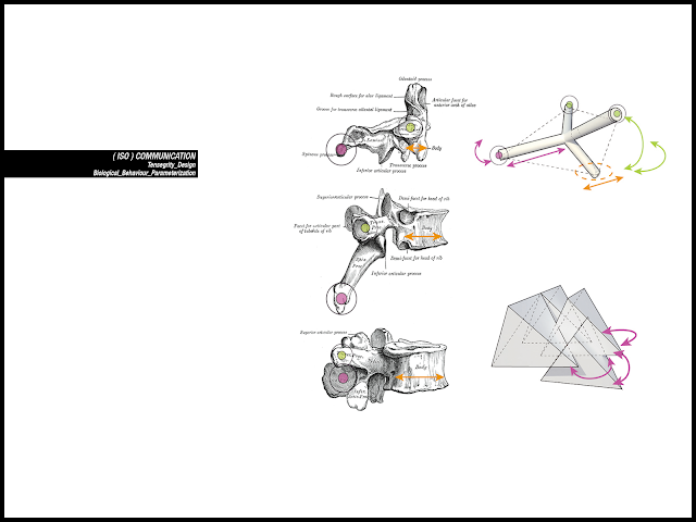
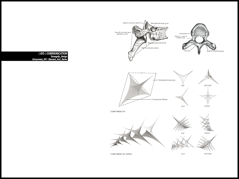
The definition of components started from the morphology’s analysis of the human vertebrae: how they modify themselves from the sacrum to the first cervical and how they remain similar to each others. Modifications arise due to different position and different roles that every different vertebra sustains.
For example the change their sectional inertia depending from their position, or their change of scale (the higher vertebrae are smaller, weight less, and less compact).
There are also similarity like the constant presence of processes, as I have already said, the attachments for muscles and tendons. We can find similarity not only in the morphology of the singular vertebra but also in the spatial relationship between one of them and another (the upper spinous process and the processes below for example).
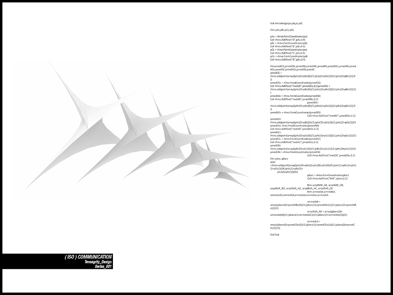
I tried to simplify as possible the rules of interaction to have the simplest model. To begin with I designed the component as a tubular element with four pieces, fitting inside a tetrahedron. The variations were the inertia of the component (e.g. how much the two “wings” moved from the starting position) and the relative position between one component and another (distance, angle). With a simple repetition and linear links between the elements, I defined a first kind of structure, growing in parallel lines with a constant law (linked to the proximity to a point) throughout a path.
Here is the script: component 000 along curve.rvb
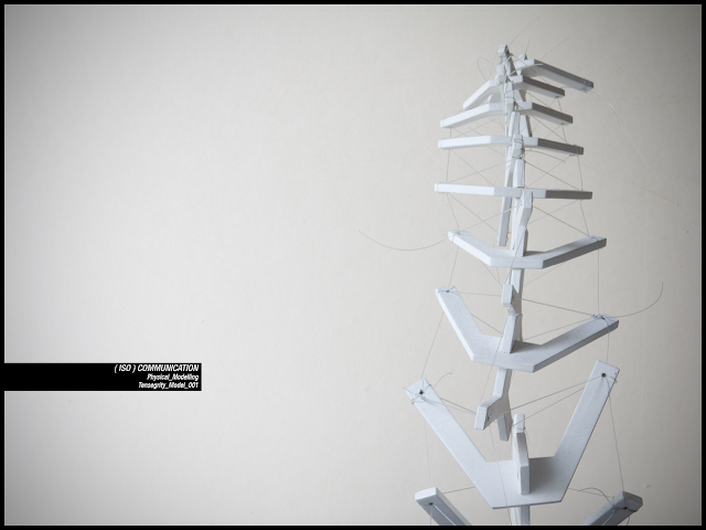
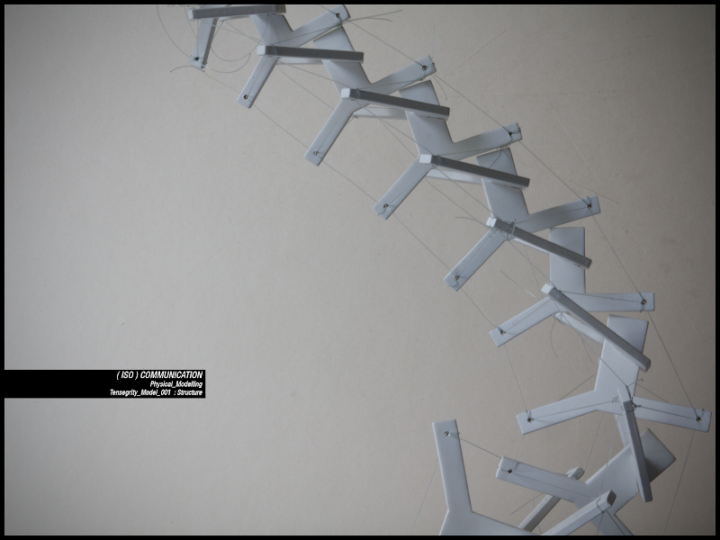
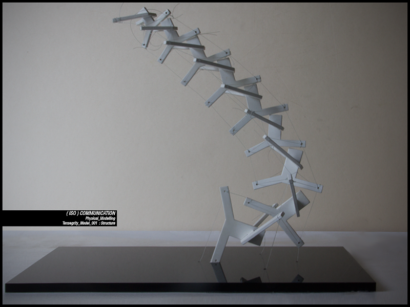
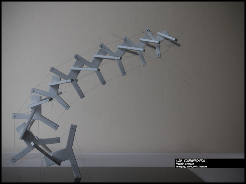
To test the coherence of this kind of behaviour a physical model was defined. Its morphology resembles these just described: tetrahedrical with an internal part almost compressed (I have to point out that even in this kind of components there are bending and curling effects between different parts) and a continuous wire. The model was designed with rhinoceros trying to have simplest bi-dimensional pieces. Because I do not own a laser cutter it was cut in wood manually with the help of a carpenter, and later sprayed with white paint. The two dimensional layers crossed creates a sort of three dimensional tetrahedron. The wire is plastic fishing line. Depending on the tension of the wire the column lifts, bends, changes its curvature and can even become almost horizontal.
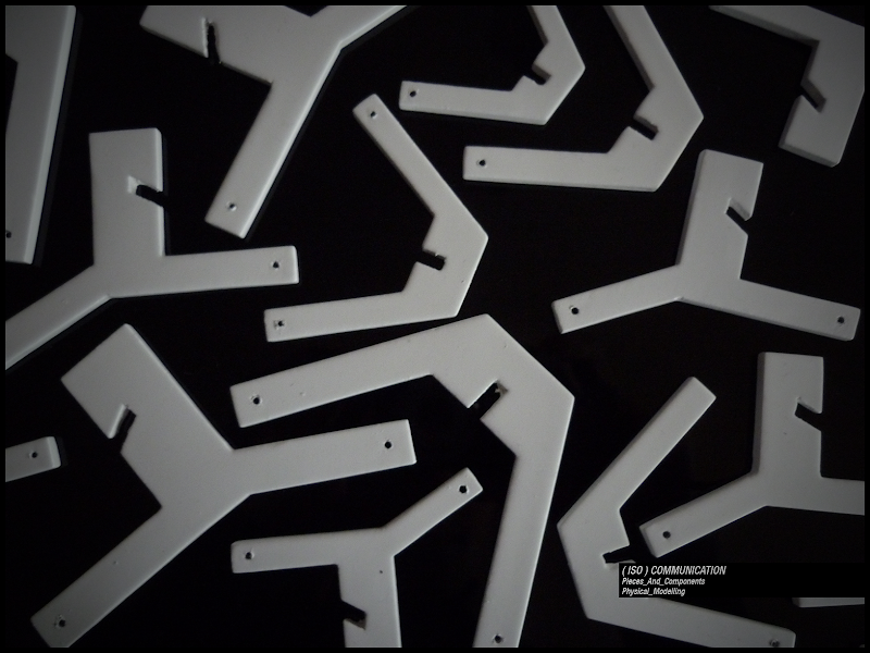
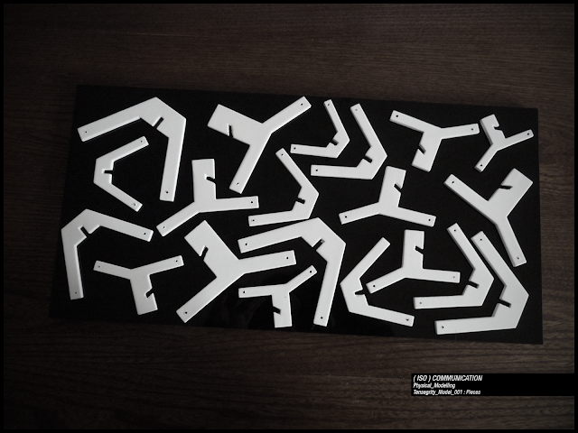
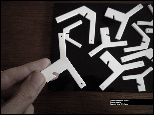
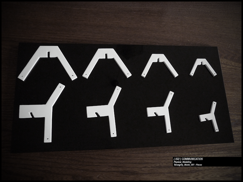
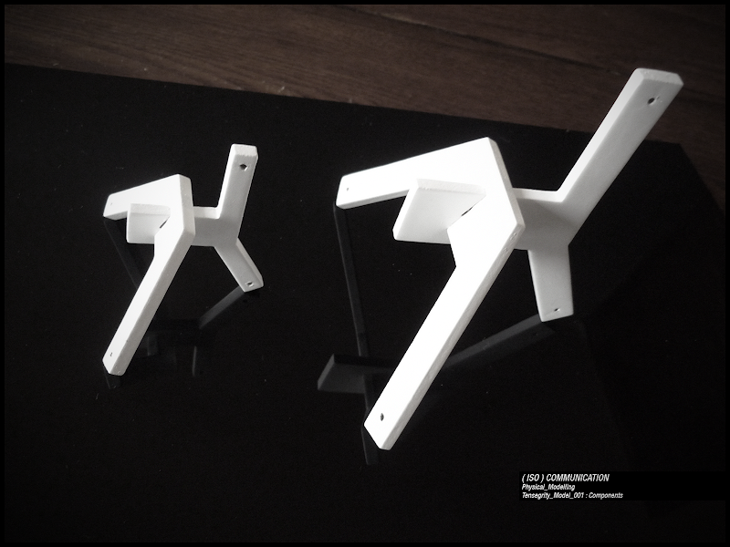
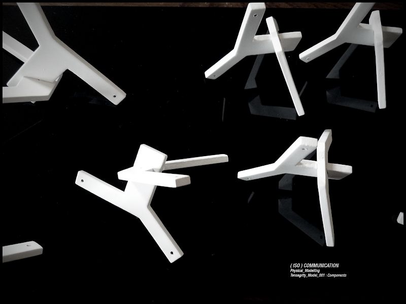
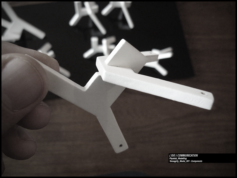
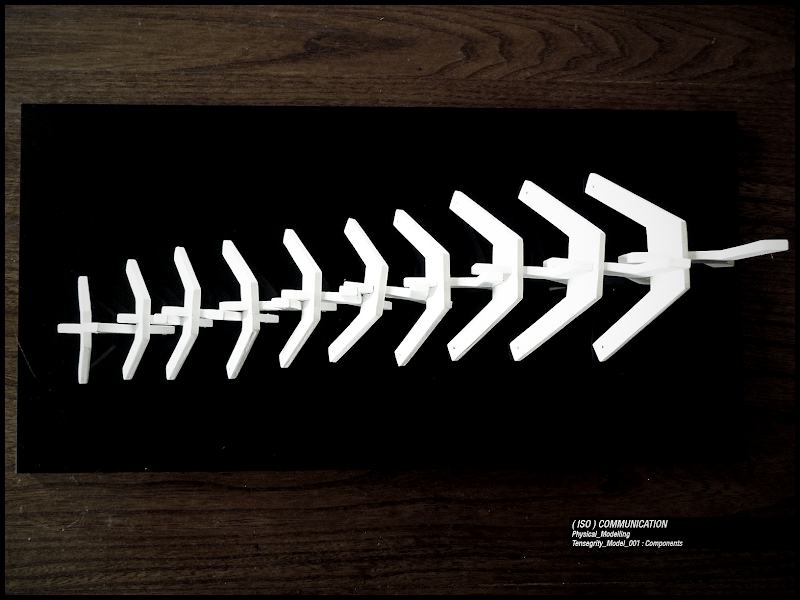
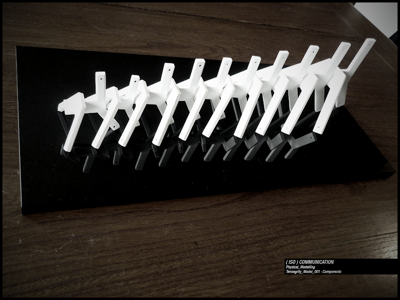
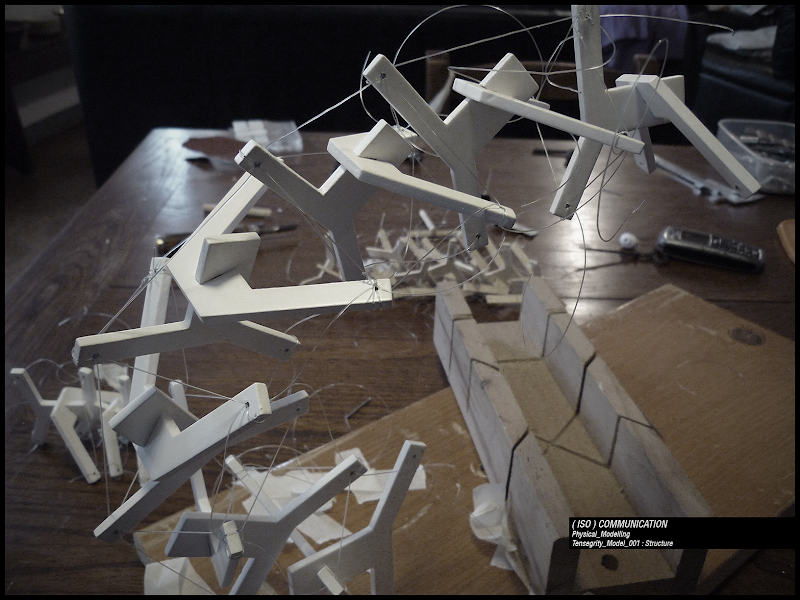
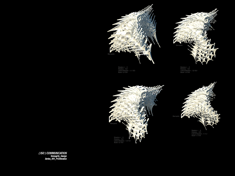
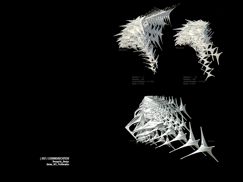
After the physical test a more complex component, still tetrahedrical, was develop and its spreading was conceived not only in a linear way but also in space to create an enclosing surface. Different values for relative positions, angles, distances and also scale created different effects.
This is the single element: series 001.rvb
And this is the spreading: series 001 spreading.rvb
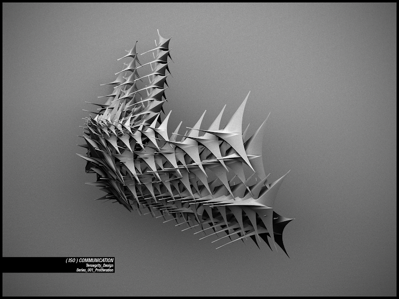
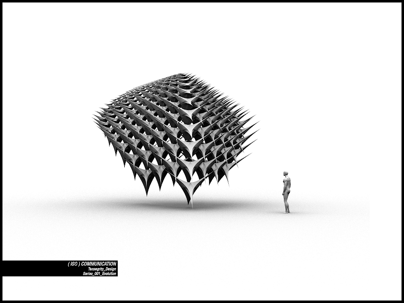
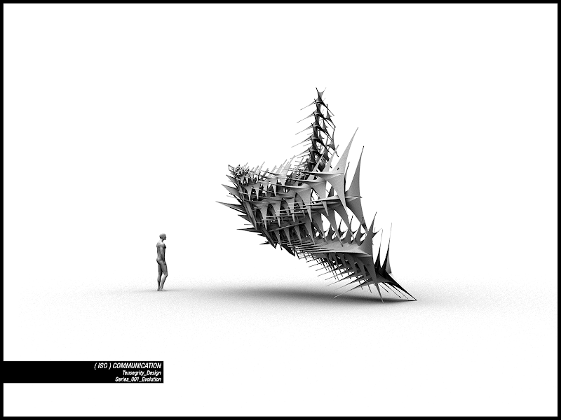
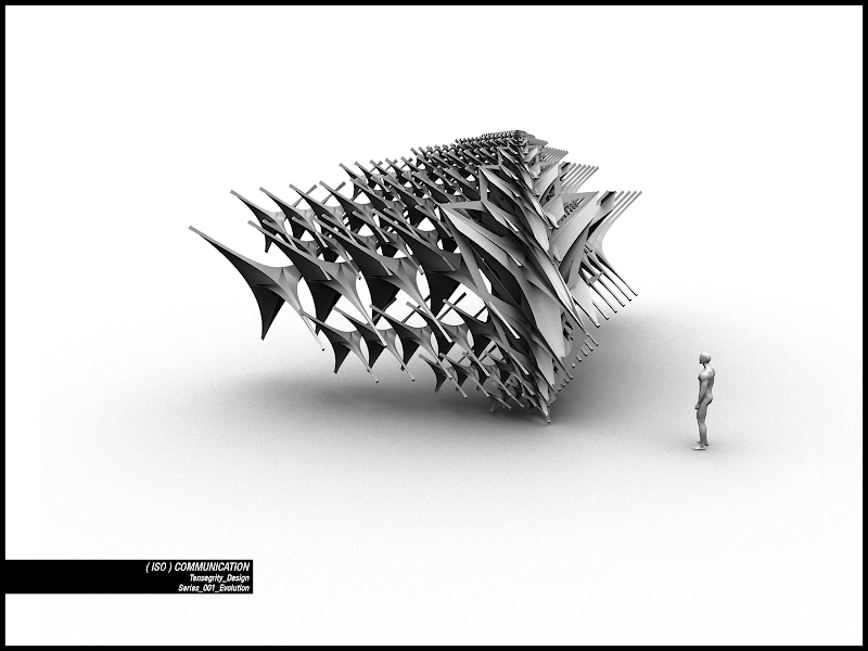
The next step was to develop tense components as surfaces and not as wires. To achieve this results the lines connecting a piece to another were substituted by membranes. And the membranes were shaped to reduce their impact both on material amount and porosity of the structure.
You can see it here: series 002.rvb
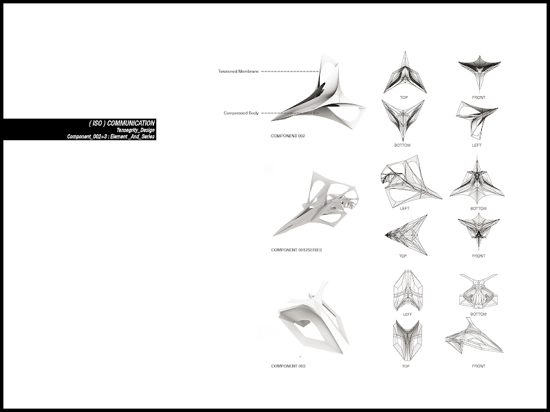
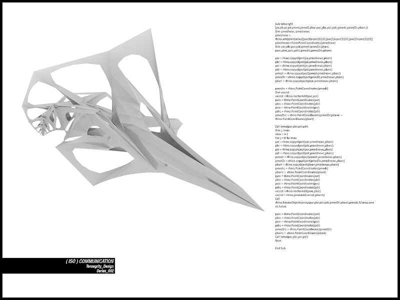
Another innovation was to link porosity to the constructive system.
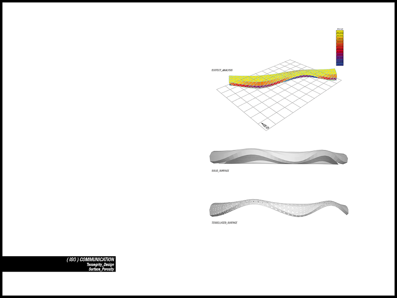
These very useful scripts written by atelier nGai were implemented to let rhinoscript interact with ecotect: first, second.
Nowadays there are other programs (like geco) which allow you to combine ecotect with rhinoceros or with its plugins (in the case of geco with grasshopper), but doing it with rhinoscript code was anyway useful.
I had to provide a mesh surface, as obj or dwg, and to export it from rhino to ecotect. In ecotect I run solar analysis on the surface and follow the instructions from atelier ngai to save the results in an excel file.
Finally I let rhino read the document and import the values of solar incidence for every component.
It was also important to set a threshold of values for porosity, and link the maximum dimension of apertures to the maximum value of the solar incidence from analysis and the same for the minimum one.
The porosity attribute was implemented directly on the component, like panels fitted on it, creating a structure with different degrees of permeability.
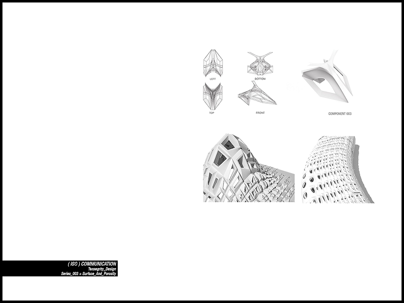
Here two examples of panels with different degrees of porosity.
The first one with simple lofted holes: porosity experiment 001.rvb
The second one with simple surfaces thought to be re-meshed, and also nice graphs of attributes: porosity experiment 002.rvb
And the link between structural element and panel : series 003.rvb
[N.B. about scripting techniques: while I firstly make components inside a tetrahedron later I preferred to fit them inside boxes, because it was easier to spread a surface with them. The secret is to define the corners of the boxes and, using vectors, let surfaces always fall inside it. To do so you have to subdivide the main box with planes defined with vector operations. For example take a box with base face’s corners named A-B-C-D. Top face’s corners are E-F-G-H. To define a plane in the mid of the box every corner of this plane is the subtraction of the lower vector from the upper vector divided by two and then added again to the lower vector. To find the first corner is something like: (E – A ) scaled by ½ and + A. I think it is one of the most important things I learnt about scripting, if you understand it you can define exactly any lines or point (from the plane you have defined) and draw a component always inside the borders of a box.]
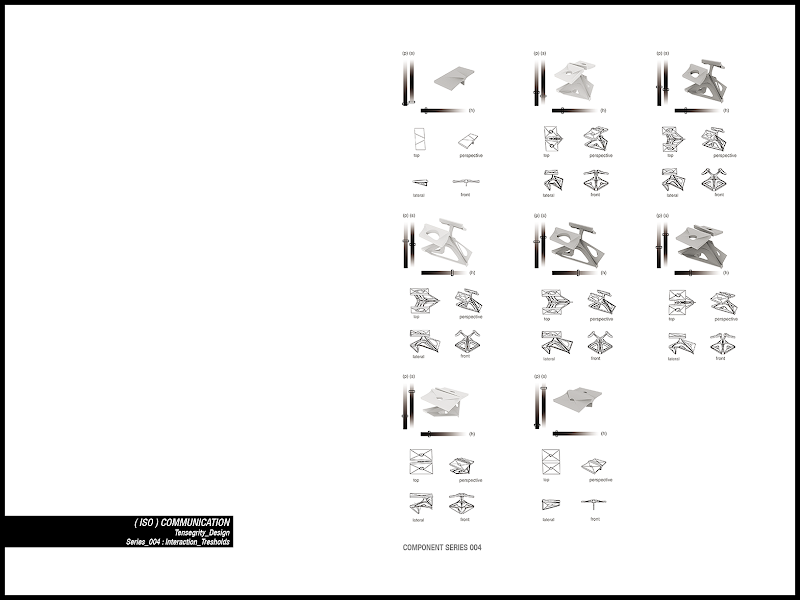
The last step was to modify a little the component, trying to make it more “elegant”.
So I simplified the element trying to incorporate in it the panel modulation and the porosity, weaving the structural part and the exterior surface together in a coherent system.
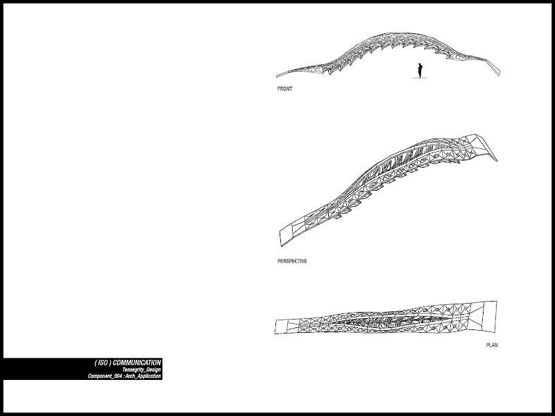
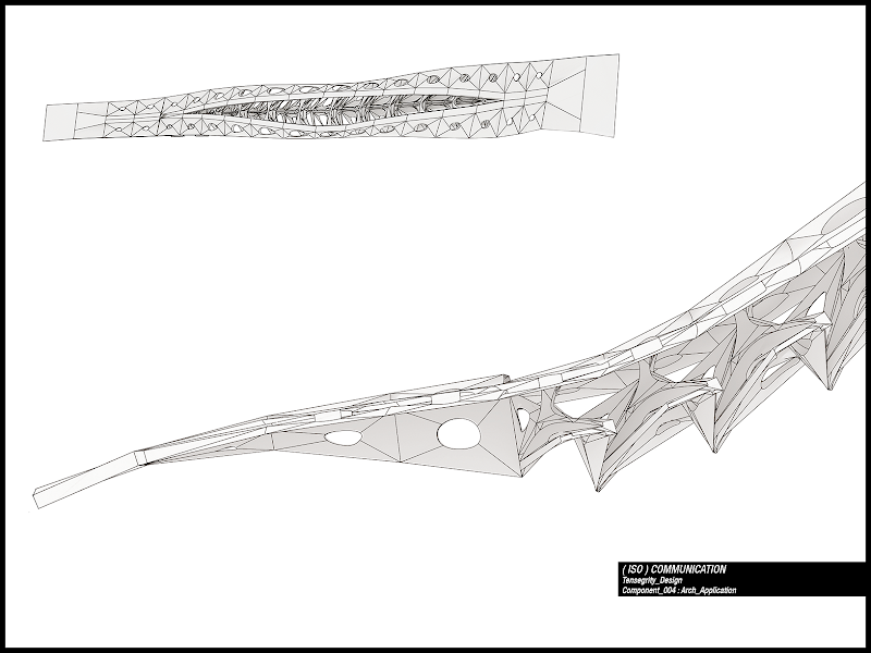
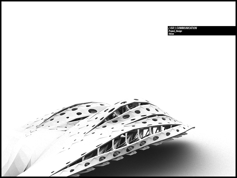
This kind of component was firstly applied on a planar surface and then on a curved one. The effect resembled in some way biological world’s shapes, but the interesting thing about it was that this resemblance was not mimetic but “came out” from itself, being the rules underneath it similar to the ones underneath biological organisms.
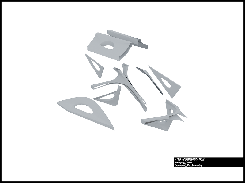
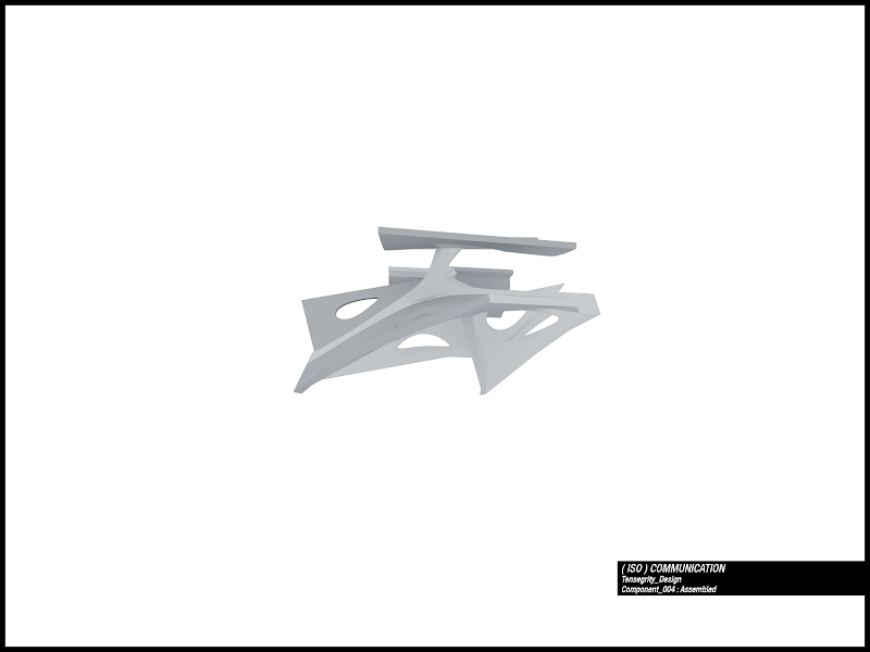
Last element: series 004.rvb
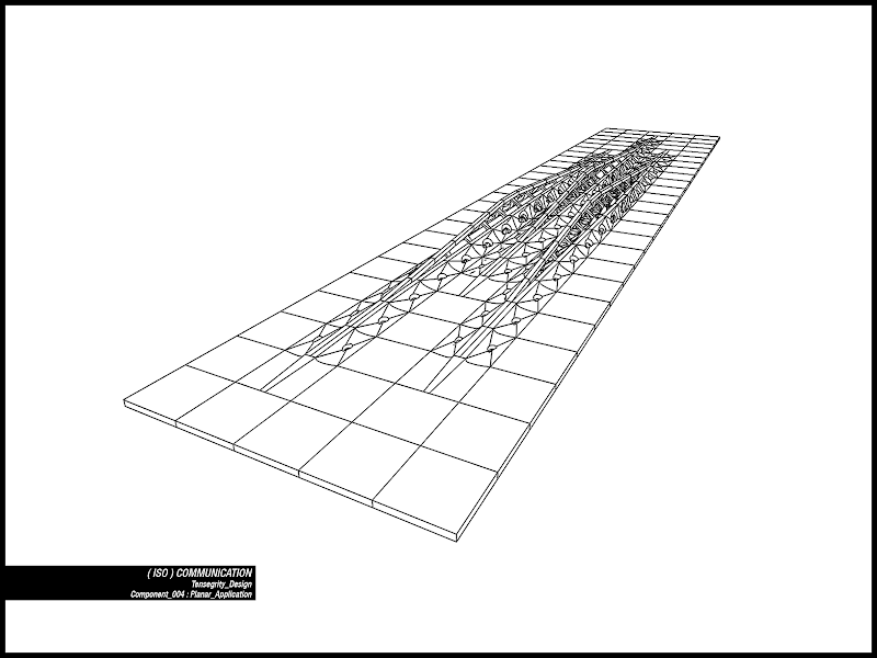
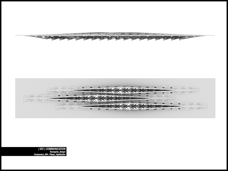
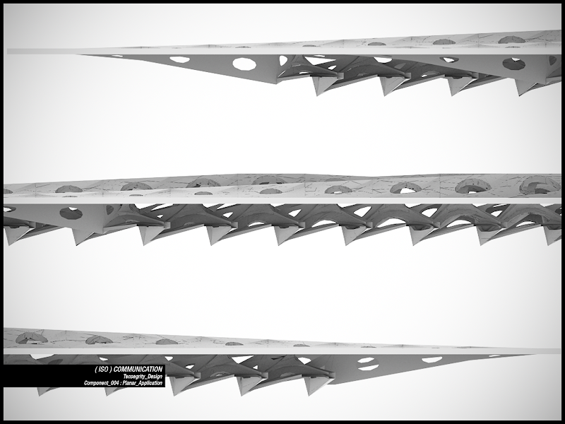
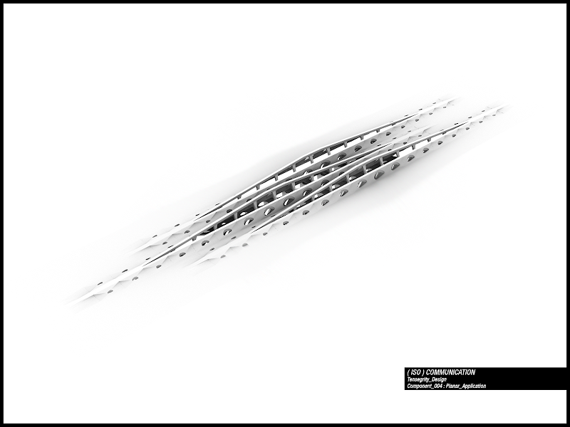
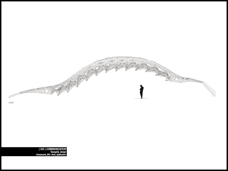
On a curved surface, every stripe is like an arch.
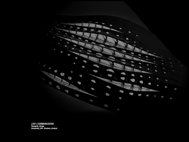
An experiment to test light diffusion from inside the pavilion.
About "elegance" in designing I will not enter in philosophical topics here but I found very interesting the essay by Patrick Schumacher you can find here. Inspiring and helpful not only as a dissertation on the nature of arts and architecture but for the analysis and the definition of an artistic/architectonical process of creation. It deals about what we perceive as “elegant” (but you can use other word to describe a coherent and attractive element, filled with a subtle logic you cannot understand at the first glance but you can feel it immediately), its design that comes out from a long, recursive, studied, process, and the concurrent presence in it of both complexity and simplicity.
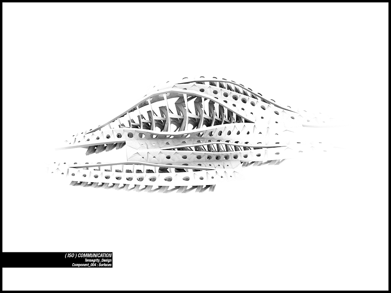
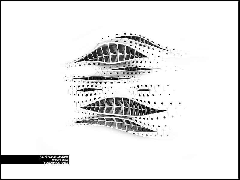
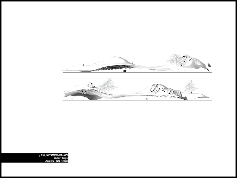
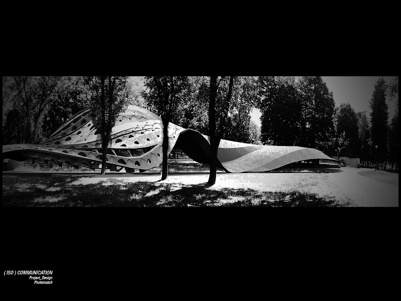
Finally the components was applied to the lower part of the Pontelungo’s pavilion, and linked to the data collected. Another interesting thing was that the surface, now differentiated in porosity degree and surface effects, kept offering multiple and alternative paths and choices for the experience and the crossing of the park (people could walk inside, outside, across, over and under the surface).
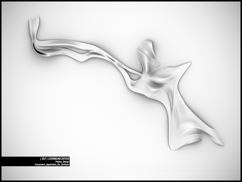
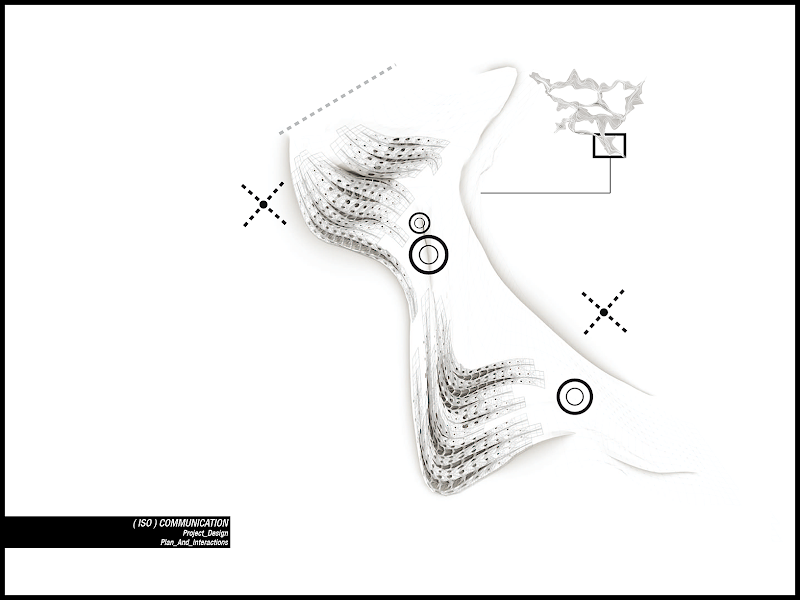
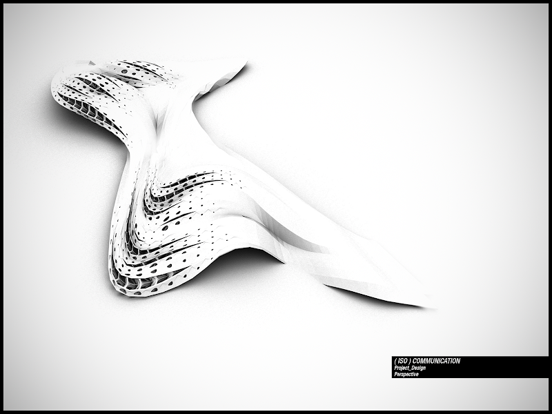
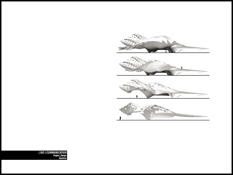
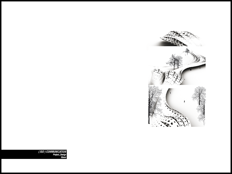
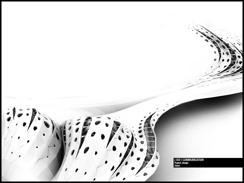
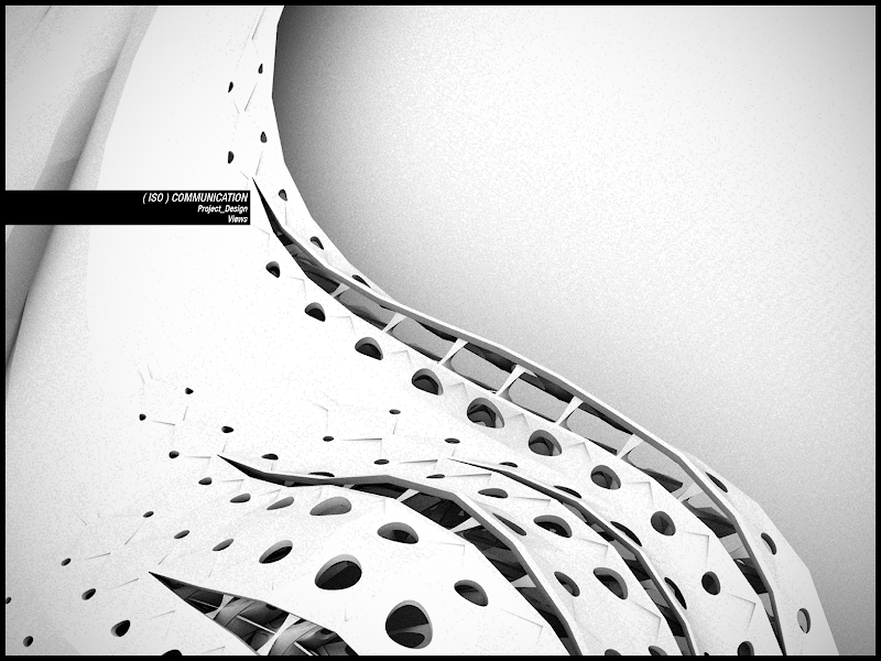
Some photomatches.
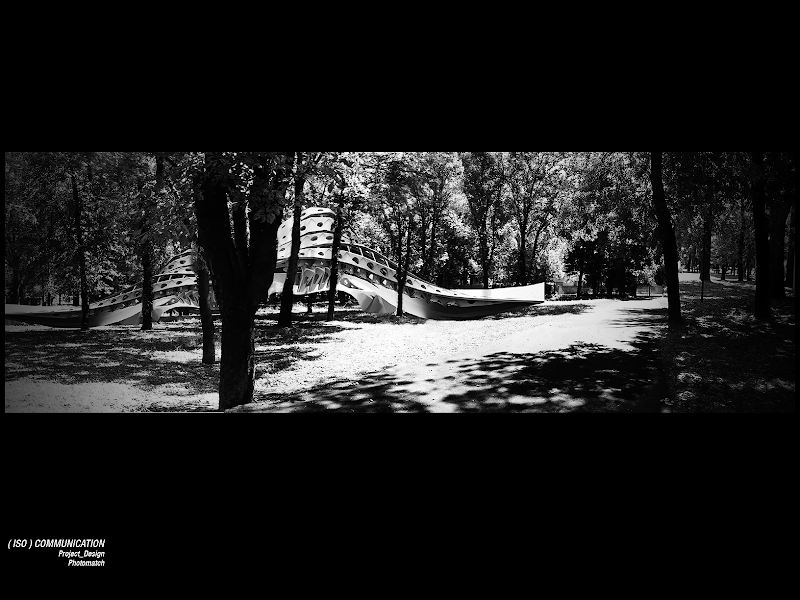
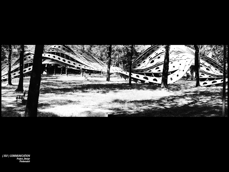
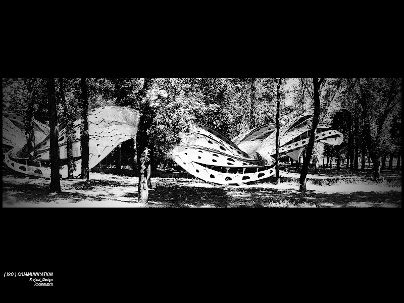
In the end the physical modelling of a real piece of this architecture. This process was very stressing because I had to fought with a very long list of accidents.
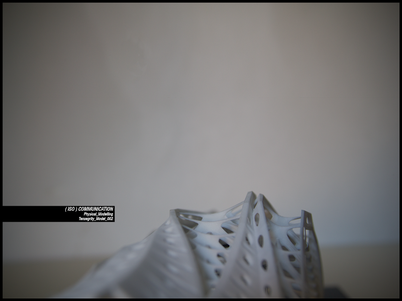
The main problem, as I pointed out in the previous post was the NON MANIFOLDS need for a printable model. What usually happens is that in a very complex model you could have made somewhere a mistake you are not able to correct anymore, or you could not find it anywhere.
Secondly it may occurs that when you convert nurbs to meshes the program you are using makes some mistakes or inaccuracy (so I suggest you, if you would like to print your model, to try avoiding nurbs as much as you can).
Now, I found some tricks and I will share them with you, hope if you read this they will be helpful to spare you a lot of time (I lost a very huge amount of time on this!).
The process is: have your model with nurbs and whatever you want (you should have worked before to have it closed and non-manifold as much as you could).
Always take the model near the origin and set rhino tolerance to mm (small objects).
[ Apart from non manifold problems you should check that your model has not parts thinner than the minimum tolerance of the printer you will use (look here for example)
And remember there is a maximum amount of polygons that are printable at one times, I think it is because printing software cannot handle too complex model. You have to think about the possibility to split your model in parts, and I strongly suggest you (I did not do it and it caused other losses of time) to create something like a groove or a joint or an external piece (less elegant) to have the different parts properly fit together. ]
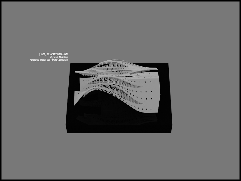
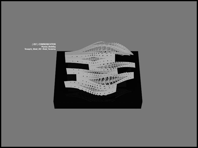
Then unify your model the rhino command. Mesh it with the minimum amount of faces without losing details. You have to do some tries, here what the rhino settings means.
Maybe it is not completely correct nut I uncheck all the boxes and let only jagged seams, it is a kind of paradox but lately it worked.
After doing that there is these group of commands I suggest you to apply iteratively (you can write a macro and let rhino do them for you for a certain number of time, obviously the first, the second, the third, etc and the again the first, the second, hope you had already catch this :)
if the model change its shape do the command manually and evaluate if one of them creates particular problems.
I have just founded but not yet tried this two plugins that may come into use:
first and second.
THEN you have to export the object. Wavefront (.obj) is a good output.
Now open blender and import the object. Click on it with the right button, press “Tab”, press “w” and “remove all doubles”.
There could be still manifolds problem, the bright side is that blender recognizes them better then rhino.
So, deselect all the vertices (press 'a'). Look at the bottom of the 3d window, above the button bar, and click
“Select->Non Manifold”.
Now the vertices counter will tell you how many vertices have this kind of problem. It is not a completely fine solution but I arranged to select groups of points very near to each other and collapse them (right click). If they are really close the geometry would not change, and it is one of the best solution I found.
Otherwise you can try
a) to hit “Ctrl + Alt + Shift + M “(all the non-manifold holes will be selected) then “F” to make faces and select “Auto” from the menu.
b) understand if there is a problem in the parameterization of the model and starting again correcting it in rhino (visualizing the non-manifold elements in blender will help you to find mistakes).
c) try again with different exportation values, sometimes some problems are fixed automatically (but you have to be very lucky).
If your model is now ok for blender export it (always in .obj format) and import it with Netfabb (the basic version of the program is free).
Netfabb has an high quality repair system so if you feel lucky you can avoid the rhino commands part, and the blender one as well, import the .obj from rhino to Netfabb and repairing it directly. If it works yes, you are lucky.
Once imported the object click on it. On the right top there is a “+” sign, click on it and perform some repair until no more invalid pieces are found. Then apply the repair, right clicking on the name of the object in the window. Finally right click on the object name and click on “export as stl”.
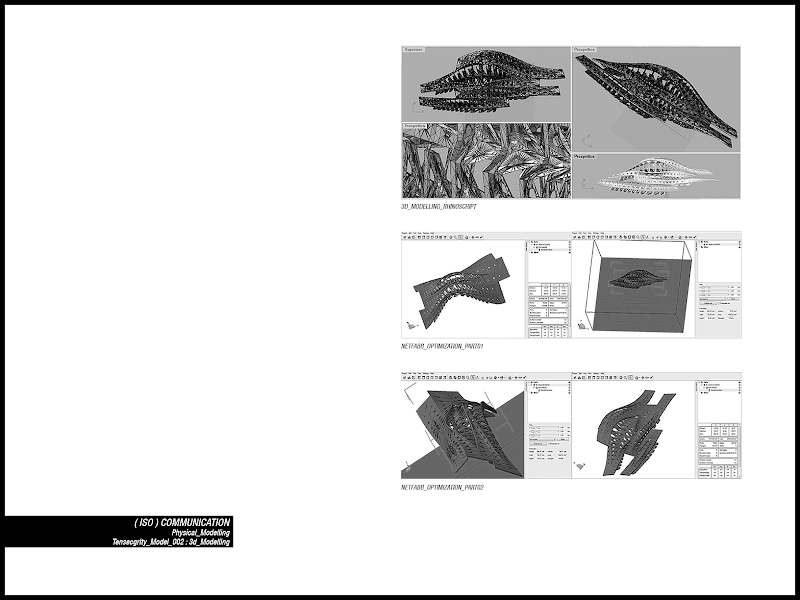
If everything is allright you can send it to your printer. I have already said I used shapeways, and, except for a little delay in delivery timing, everything was ok and cheaper compared to all the prices I found on the internet.
You have to register and upload your model to their site, if it is printable it will be shown in a gallery with the price depending on the material you will chose for it. But beware that the first control of printability does not take in consideration the minimum thickness of the pieces. So you have to check it manually during the first steps, otherwise they will send you a very nice letter, some day after the order, telling you that your model is not printable at all and you have to fix the problem, and even if they try to help you, it will be another loss of time.
[to look how it works this is my gallery. As I left the possibility it you can also buy my model, in this case I didn’t put any extra on it but if you want you can open a sort of shop and sell your creations, and they will get the money via paypal]
Hope this will need to you, knowing this things would have spare me a lot a problems..
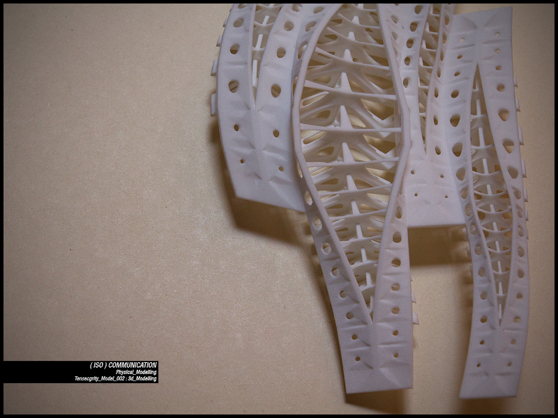
Anyway here is my beloved model. Firstly the two pieces unassembled.
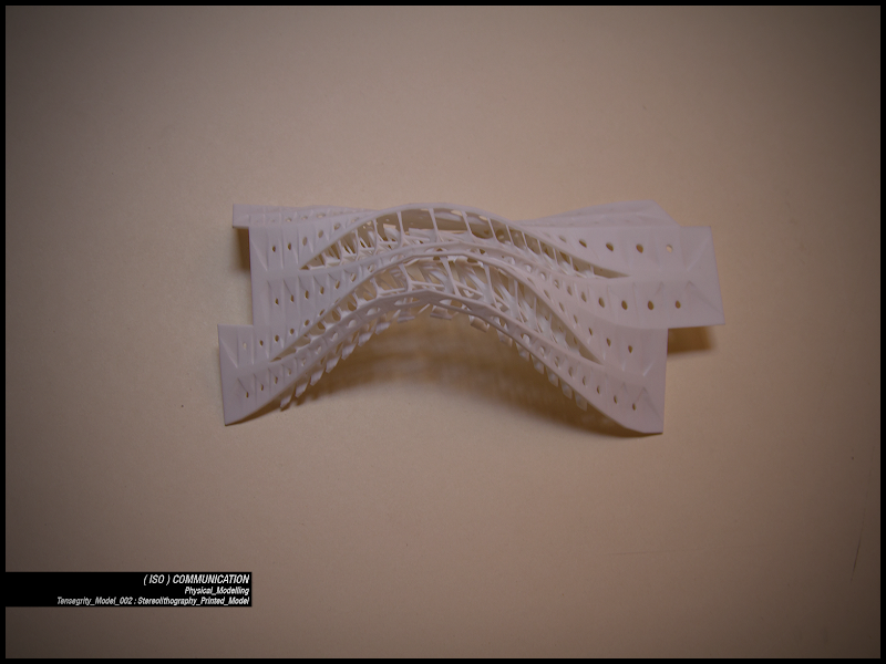
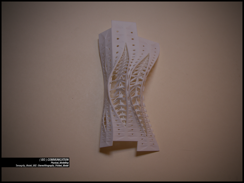
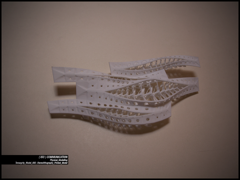
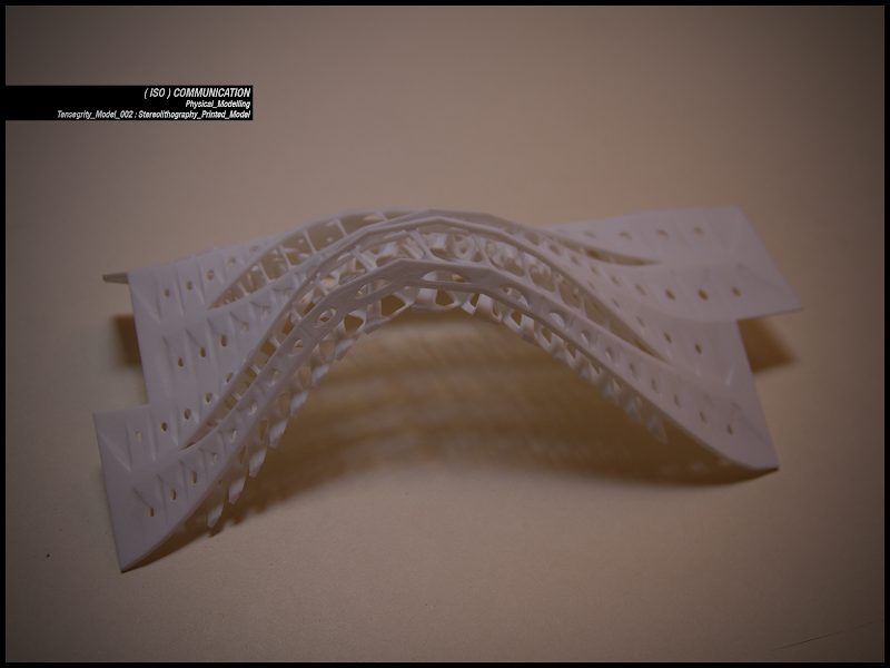
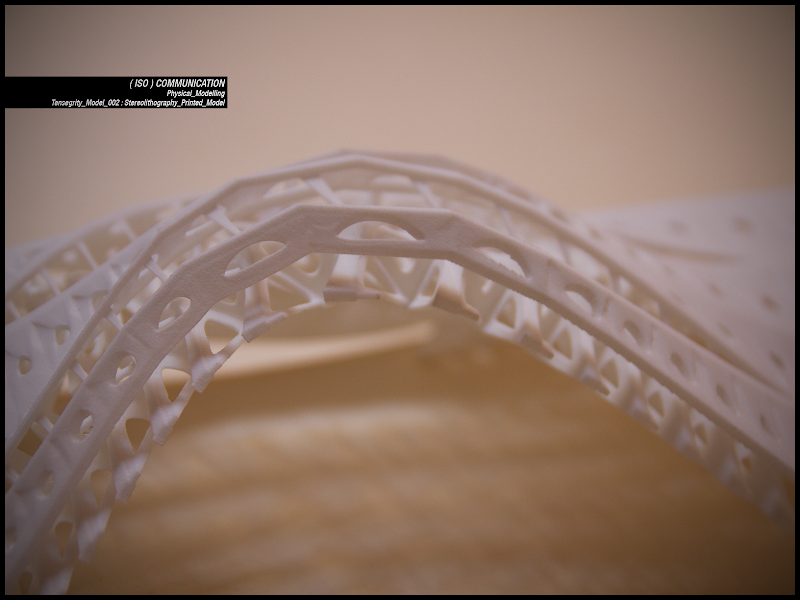
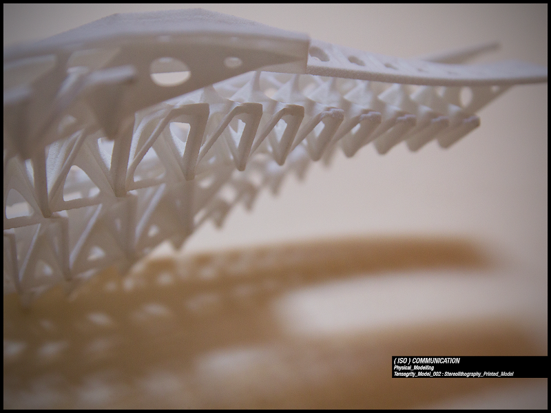
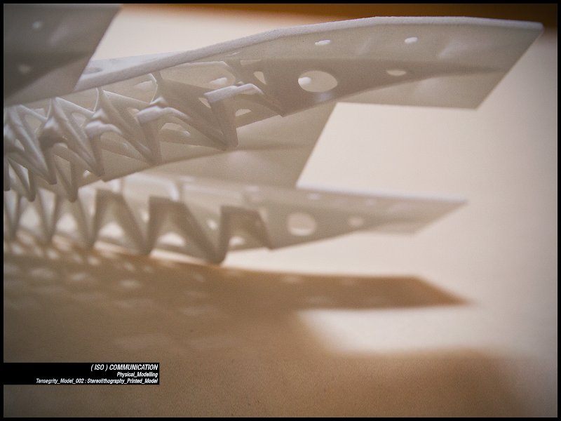
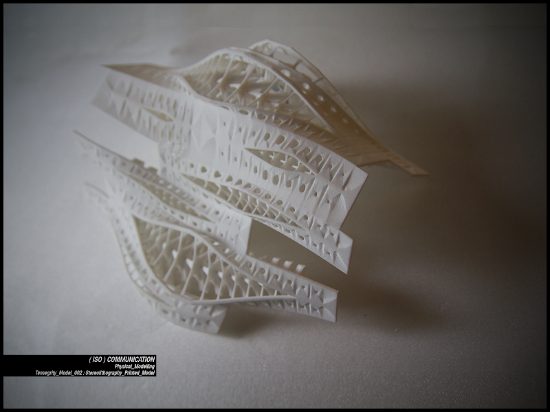
And then assembled.
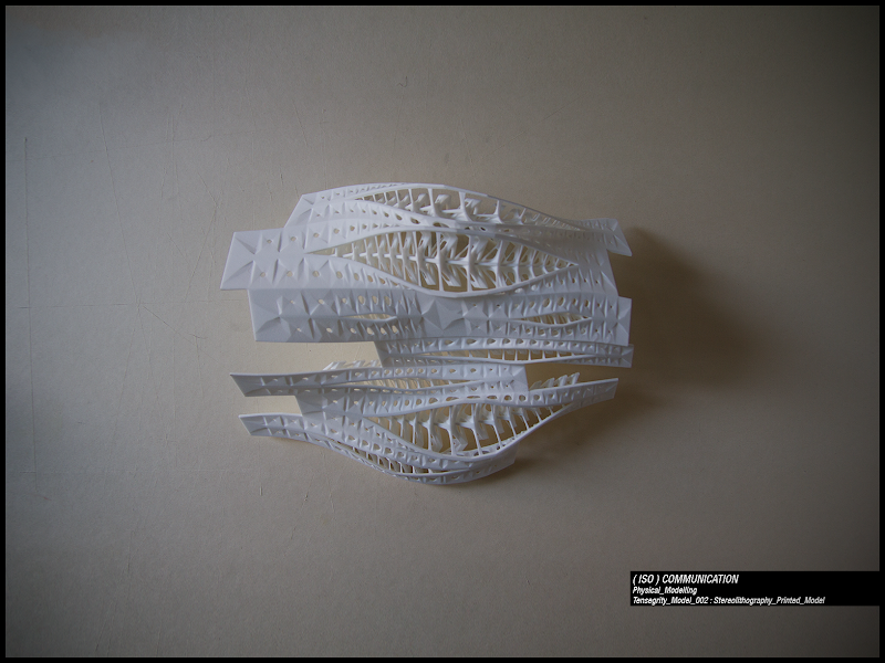
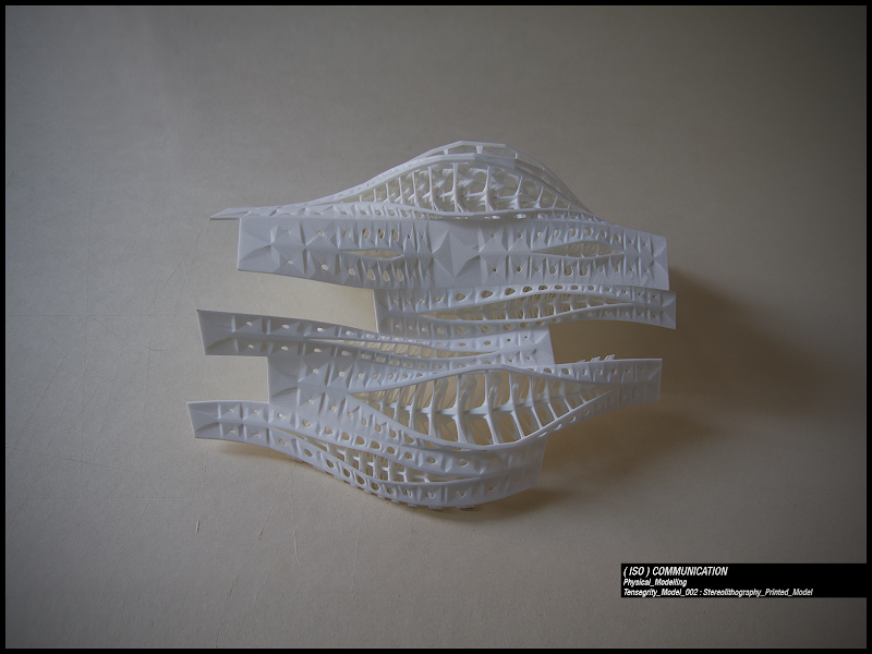
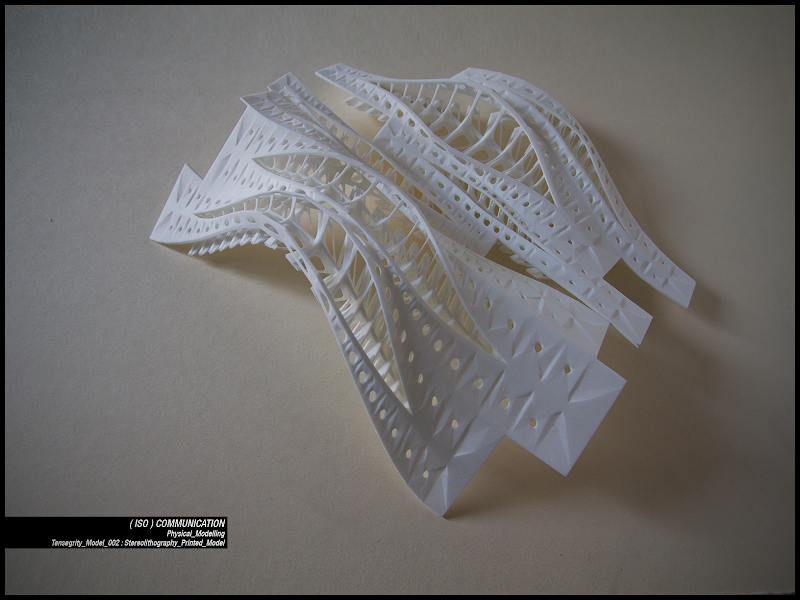
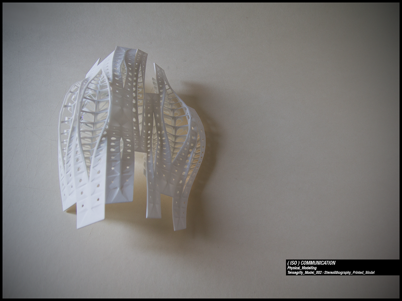
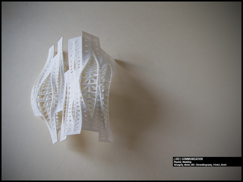
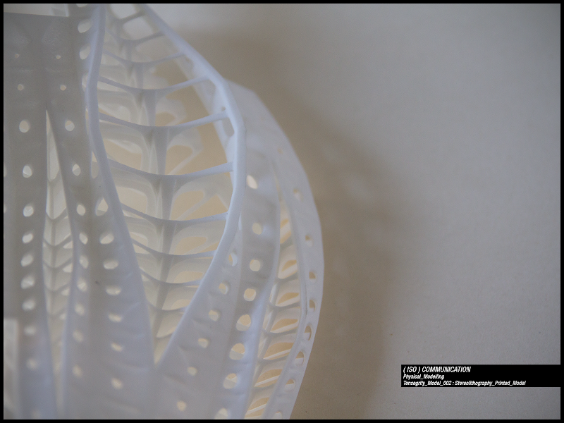
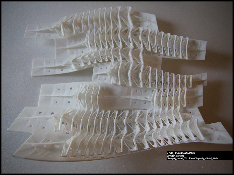
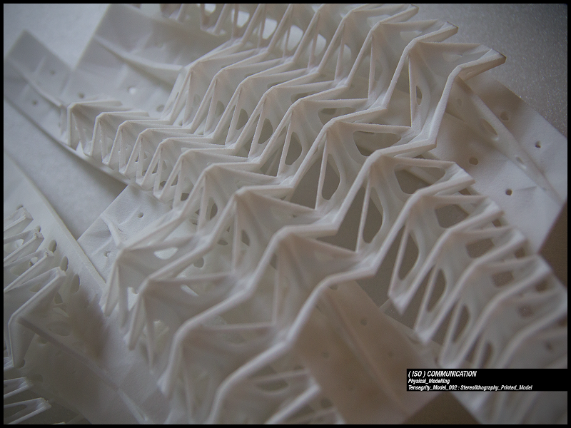
I have to say I was very pleased that my model was commented on a page of Bdlg blog.
And I also suggest to visit my supervisor’s page on flickr where you can find also picture of other student’s models.
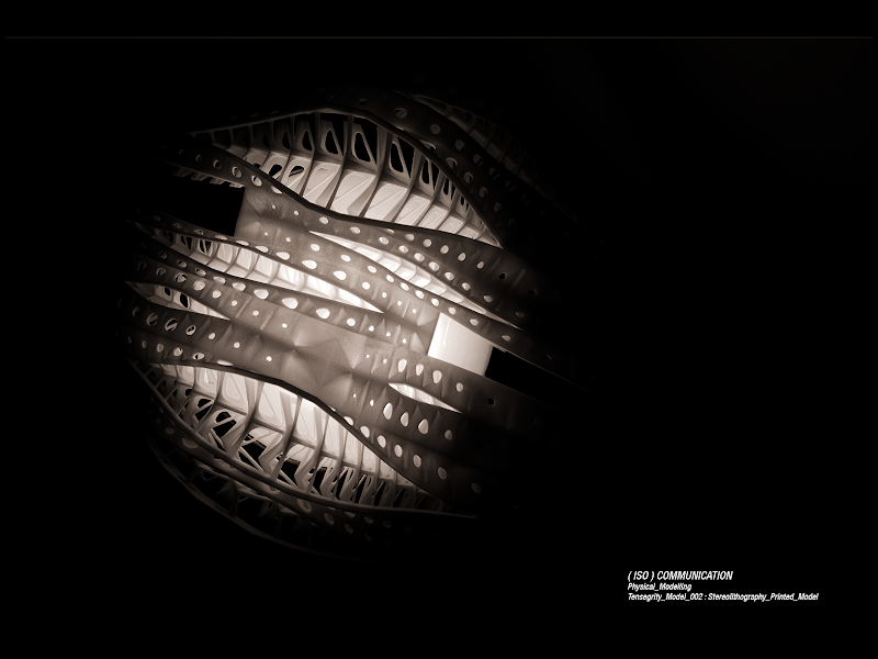
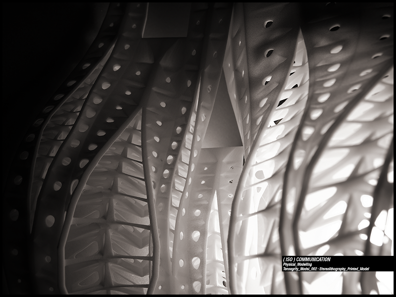
Finally I put the model on a black plexiglass base.
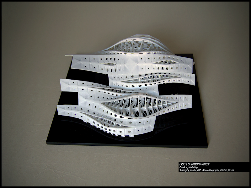
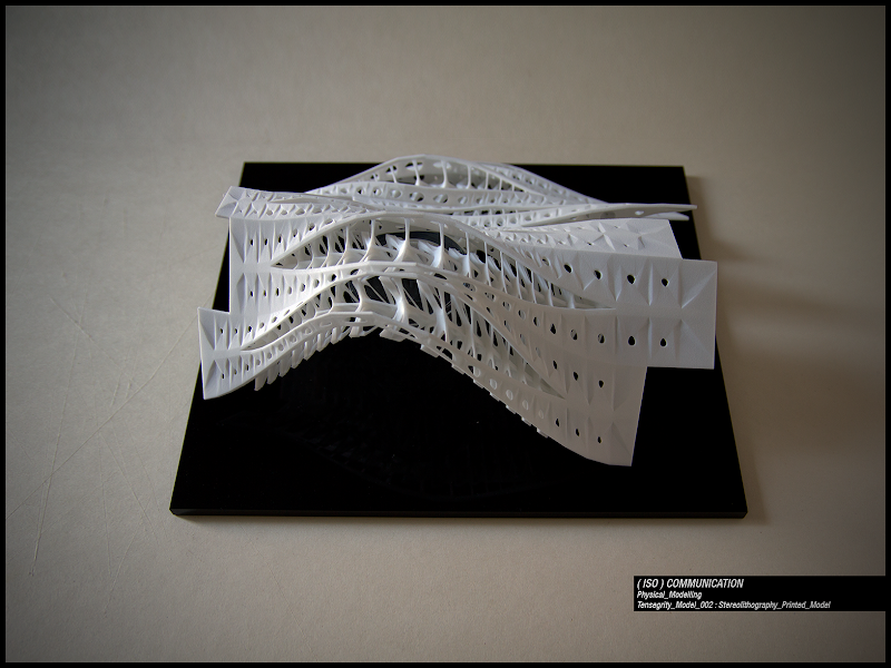
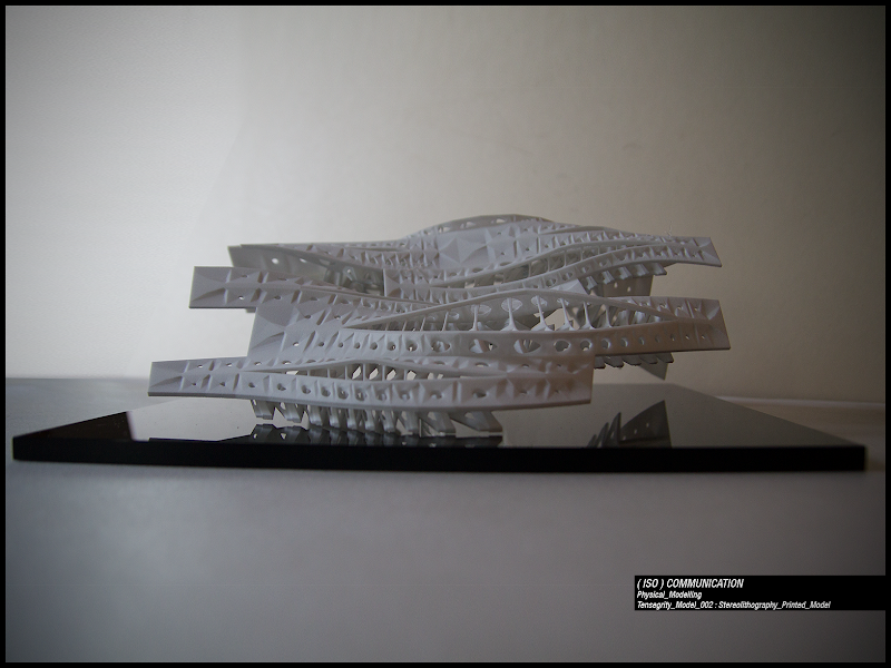
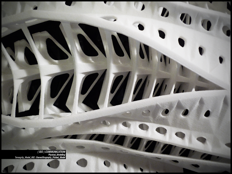
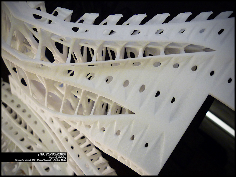
Finally some lighting experiment.
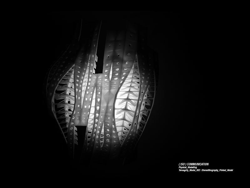
Here is a short bibliography. (Apart from tensegrity, interesting lectures about contemporary architecture's thoughts and strategies)
AADRL, Ten, AA publications, 2010 London
BOUMAN Ole, 3d>2d: The Designers Republic’s Adventures in and Out of Architecture, Te Neues Publishing Company, 2001
BURKHARDTR. W., A Practical Guide to Tensegrity Design, Copyright 2004-2008 P.O. Box 426164, Cambridge, MA 02142-0021
BURKHARDT, R.W., A Technology for Designing Tensegrity Domes and Spheres, [on-line], Cambridge (USA) http://www.channel1.com/users/bobwb/prospect/prospect.htm#sec
CAPON Brian, Botanica, Edagricole, Milano, 1999
CHANDANA PAUL, Evolutionary Form Finding of Tensegrity Structures, Mechanical and Aerospace Engineering Cornell University, Ithaca, 1997
D’ARCY Wentworth Thompson, On Growth and Form, Dover reprint, Mineola, 1992
DELANDA Manuel, War in the Age of Intelligent Machines, Zone Books, New York 1992.
FERRE Albert, Verb Natures: Architectural Boogazine (Actar’s Boogazine); Architecture
Boogazine edition 2007
FULLER R.B. Synergetics, Macmillan Publishing Co. Inc., New York, 1975
GOLDFINGER Eliot, Animal Anatomy for Artists: The Elements of Form, Oxford University Press, Oxford, 2004
HENSEL Michael, MENGES Achim, Morpho-ecologies, Architectural Association, London, 2006
INGBERG Donald E., Cellular tensegrity: defining new rules of biological design that govern
cytoskeleton, Journal of Cell Science, No.104, pp.613-627, 1993
INGBERG Donald E., Tensegrity I. Cell structure and hierarchical systems biology”. Journal of Cell Science, No.116, pp.1157-1173, 2003
INGBERG Donald E., Tensegrity II. How structural networks influence cellular information processing networks, Journal of Cell Science, No.116, pp.1397 -1408, 2003
JAUREGUI Valentín Gómez, Tensegrity Structures and their Application to Architecture, thesis Submitted to the School of Architecture, Queen’s University, Belfast
JOHNSON Steven, La nuova scienza dei sistemi emergenti, Garzanti, Milano, 2004
KERCKHOVE Derrick de, The Architecture of Intelligence (The Information Technology Revolution in Architecture), Birkhäuser, Basel, 2001
KOLAREVIC Branko, Architecture in the Digital Age: Design and Manufacturing, Taylor & Francis; London, 2005
LEVIN, S.M. “Continuous Tension, Discontinuous Compression. A Mode for Biomechanical Support of the Body”, Bulletin of Structural Integration, Rolf Institute, Bolder. Reperibile anche su http://www.biotensegrity.com
LUTTGE Ulrich, KLUGE manfred, BAUER gabriela, Botanica, Zanichelli, Bologna, 1997
LYNN Gregg Animate Form (Hardcover)Princeton Architectural Press; 1 edition (January 1, 1999)
MOTRO R., Tensegrity: Structural Systems for the Future, Butterworth-Heinemann, 2006
MUNARI Bruno, Design e comunicazione visiva, Laterza, Roma, 2006
MUNARI Bruno, Da cosa nasce cosa. Appunti per una metodologia progettuale, Laterza, Roma, 2006
MYERS T.W., Anatomy Trains, Churchill Livingstone edition, Edinburgh 2001
RAISER Jesse, Atlas of novel tectonics, Princeton Architectural Press, New York, 2006
RUTTEN David, RhinoScript for Rhinocerous 4.0, Robert McNeel & Associates, 2007
SCHUMACHER Patrik, Arguing for Elegance, published in: Elegance, AD (Architectural Design), January/February 2007
SNELSON, K. (1990) “Letter from Kenneth Snelson” to R.Motro, International Journal of Space Structures, 1990, seperibile anche su http://www.grunch.net/snelson/rmoto.html.
VENTURI Robert, Complexity and Contradiction in Architecture, Harry N. Abrams, New York 1977
http://en.wikipedia.org/wiki/Tensegrity
http://www.childrenshospital.org/research/Site2029/mainpageS2029P23sublevel24.html
http://georgehart.com/virtual-polyhedra/vp.html
http://www.childrenshospital.org/dream/DrmRsch04/mechanical_p.html
http://www.tensegridad.es/
http://www.anatomytrains.com/explore/tensegrity
http://www.comune.bologna.it/comune/psc.php
Finally, as always, a slideshow with images from the thesis (thanks to Marastu for the music, Inception soundtrack remix, on facebook)
Hope this was interesting for you, if you have any question, comment or whatever do not hesitate to contact me.


